


Dear Letter Drop readers,
Do you have a hard time choosing colors? Colors matter so much that I always spend a lot of time doing color studies. In the last Sunday Sketchbook post, I wrote about my studies with the color temperature. I’ll share another must-do step in choosing colors this week: the value test.
My color study starts by choosing whichever colors I feel like using for the artwork, then the color temperature and values. Values are the level of lightness, and it can range from white to black. Using values, you can push forward or pull back the elements of the artwork, depending on which part you’d like to put an emphasis on. Also, it helps each element to stand out independently instead of blending into the background.
But my artwork has a full range of colors. How do we see the values of the non-black and white colors? I could convert it to black and white, but what's next?
There’s a simple method I use on Procreate. This is probably the best time for digital tools to shine their light by allowing us to quickly explore various options without worrying about wasting paint.
Here’s a sample 🌷 I drew to demonstrate each step.
Flower Lv.1 🌷
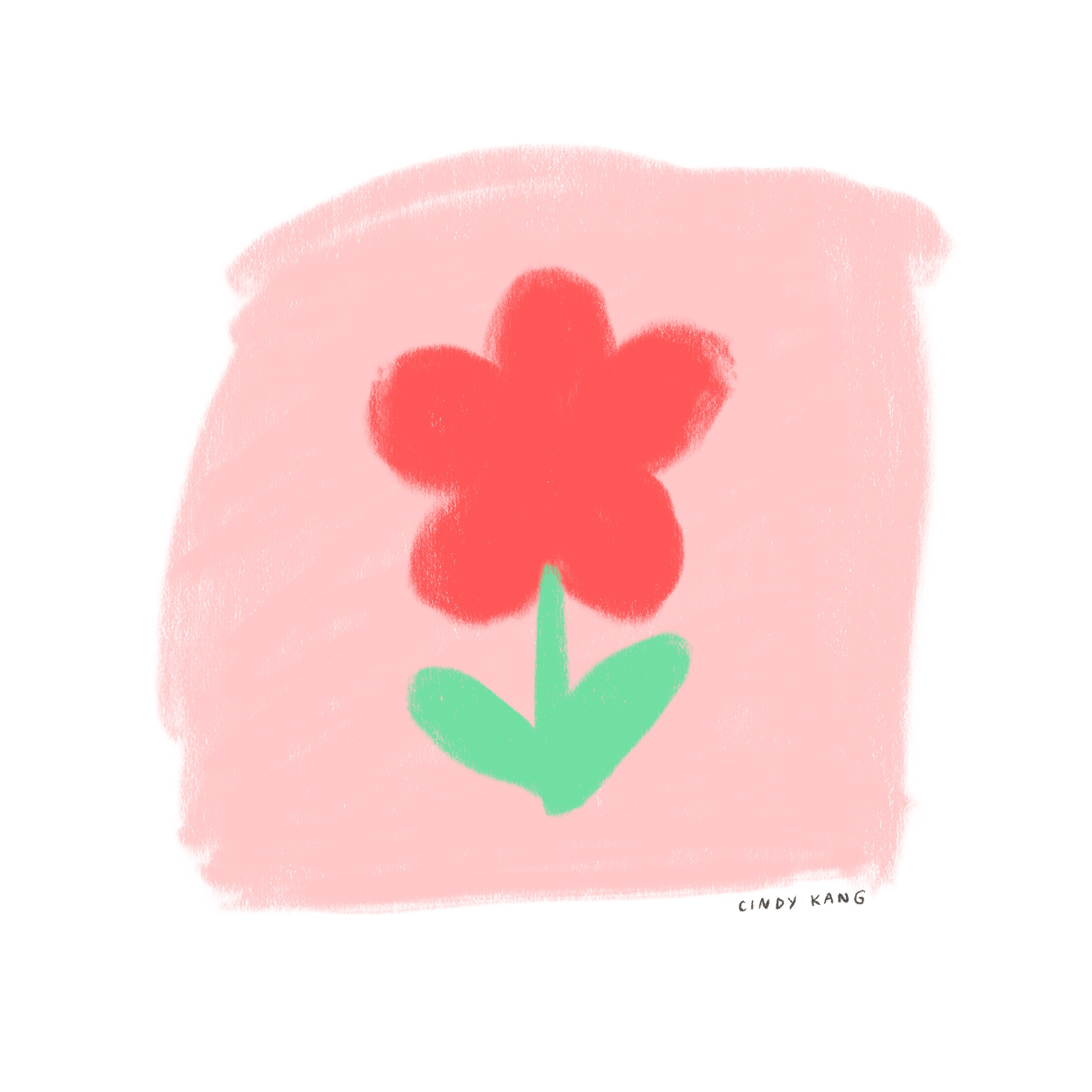
Here’s a red flower with a green stem on a pink-tone background. Do these colors work together? Maybe it's working, but there could be a better color combination. It doesn’t need a big adjustment - just a slight change in values would work.
Follow the next step!
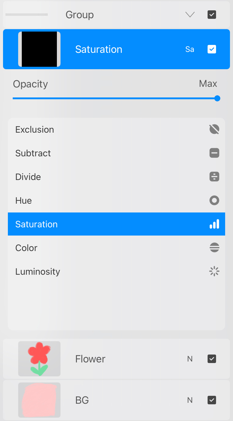
📌
Create a layer on top of the artwork layers, and fill it in with black (hex code: #000000). Then set the blend mode to “Saturation”.


That’s it! Take a look at the black-and-white version. How does that look? It doesn’t look too bad, but there might be a way to make it work better, perhaps much clearer. Adding more contrast or details would help some elements stand out and separate the flower from the background.
Also, the green stems feel so neon in this light pink background that it hurts my eyes. I decided to make the green darker and add some more details.
Flower Lv. 2 🌺
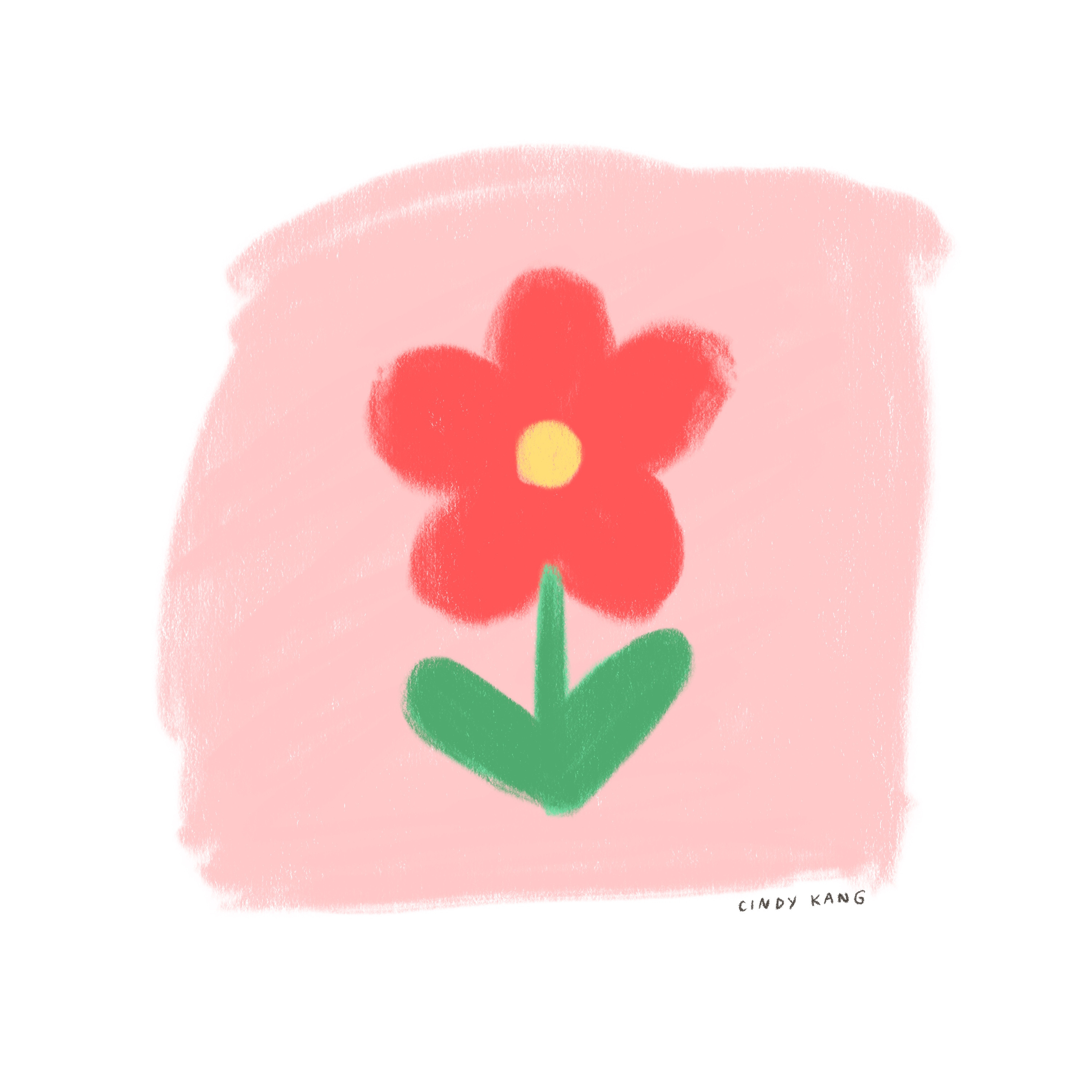


I drew a bright yellow disk on the flower that would help the flower pop out more. It seems less dull than the Flower Lv.1 now.
When you look at the B&W version, you can see that the value of the bright yellow disk is similar to the background color. Also, the flower petals and stems have similar values, and they almost blend into each other.
This drawing needs separation of each part and improved contrast overall. By toggling the Saturation layer on and off, I adjusted the colors little by little again.
Flower Lv. 3 🌸


Lighter areas got lighter, and darker areas got darker. The flower does not blend into the background anymore in the B&W version. Each part has different values of gray. It’s a subtle change, but I could see that the image has gotten so much clearer.
Here’s the final comparison between the Flower Lv.1 and Lv.3.
Final Comparison


Even though it’s not a huge difference, the image feels more balanced now. There was no need to change the entire color palette - just checking and adjusting the color values little by little and adding a tiny detail.
One Last Squint!
The last step is to SQUINT! and look at the image. Is it easy to tell what’s going on? Do you see the image of the flower that actually looks like a flower?
Does the composition seem balanced? Is the image clear enough? Try this when working on more complex images. It really helps.
Turn off the Saturation layer, and…DONE!
If you are happy with what you see in the black-and-white image on the Saturation layer, then it’s time to enjoy the color study/palette you created. Now, turn the layer off, and use your color guide to finalize the work.
I can’t emphasize how much learning about values helped me in my illustrations. Especially because my works are very colorful and often about space with strong light and shadow, it was so stressful when the final works looked dull or just not as exciting as I imagined them to be.
After experimenting with high-contrast images, I learned that it's not just about adding more black or white to the darker and lighter areas. It's about using various colors and values to create contrast. By adjusting the values, the image could be more exciting and atmospheric.
I hope this made your art-making journey easier, more motivated, and more fun!
Thanks for reading!
Sincerely,
Cindy
***
Letter Drop will be on a break from March to April - I will only post Monthly Letters during this period. You can also find me on Instagram and Bluesky. Thank you! 🌻